Human-Centered Design for AI is About Making the Invisible… Visible
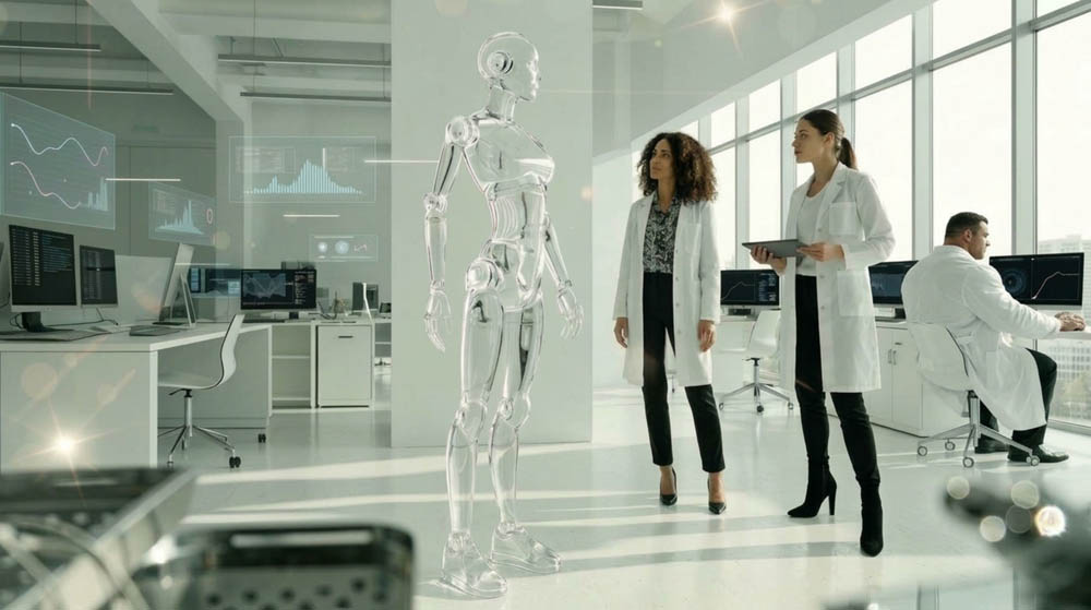
Consider a scenario where someone fires up an AI business tool and puts in a straightforward query: “Why did we see a drop in sales last month?”
Within seconds the system starts processing and computing, you can almost image the computer chips glowing with electricity as the system processes your request; and then it responds with a nicely put together response and an explanation that has all the right confidence to it.
It seems fine enough, until your boss asks the more troubling question of where the answer was derived from. It is at this point when the color in your face fades, and you feel slightly sick to your stomach.
If there is no way for a user to know that answer, the whole exercise can feel rather like putting in for a quarterly report with a fortune teller. The information may be of use, but what is going on behind the scenes is a mystery.
Human-Centered Design
Human-centered design for AI is meant to address this. And by that we don’t mean laying bare every model parameter or line of code; most people have no interest in that. What they want is plain visibility into what the AI has done and why, and some recourse if the outcome is not to their liking. In short, the best UX is not about magic, it is about clarity.
There is a certain logic to the way product teams are building AI interfaces these days. The temptation is to keep things simple and let the model do the heavy lifting. After all, you don’t need to be an engineer to drive a car. But AI is not your typical software feature. Put the same numbers into a calculator and you get the same result. An AI system will interpret language and make calls that are not always obvious to the person at the keyboard.
Take an AI recruiting app that puts forward three names for a vacancy. The hiring manager has the candidates in front of him, but unless he knows whether the ranking was driven by education, skills or past job titles, he is hard pressed to evaluate the recommendation.
Good Design Reveals the Right Things, Not Everything
It should be built around the questions a user is going to ask. Why this? How sure is the system? Can I put it right? These ought to be part of the interface from the start. A 14-page treatise on model architecture is not what a user needs to decide if a sales forecast on his dashboard warrants his time. A few words to the effect that the projection is based on six months of history and current pipeline data will do.
The difficulty is in how much to show. Too little and you have a black box. Have a user hit “Explain” and hand them three pages of jargon and you have merely made the black box more complicated.
Progressive disclosure is the way to go. Start with the basics and let the user dig deeper if he wants.
The AI might suggest a change to the campaign budget because conversion is down and costs are up. That is the why. If the user wants the details of the historical trends and performance data the system used, he can inspect them. An executive will be content with the headline; an analyst or specialist will open up the assumptions. One interface can serve them all without making any of them an AI expert. That is what you want from a good UX.
Providing a Mental Model for the AI

It is not necessary for people to have a complete grasp of an AI system, but they do require a reasonably sound idea of how it will behave. In this regard, the language of the interface takes on some importance.
Take an AI writing assistant for instance. An interface that states “The system knows what you mean” sets up the false impression that the software has a human-like understanding of intent. It is better to be less flashy and more useful with something like, “The assistant will draw on the conversation and your documents to put together a response.” The distinction is key. Users base their decisions on what they perceive the system can do; if an AI seems more capable than it is, trust will be misplaced. Good design is as much about managing those expectations as it is about usability.
Don’t Confidently Pretend to Be Certain
An AI can put forward an answer with a lot of confidence even when the data behind it is thin. The interface should not obscure that. Yet tacking on a figure like “87% confidence” does little good since most users have no frame of reference for what that number means.
A product would do well to put uncertainty in actionable terms such as:
- “This recommendation is from limited historical data”
- “We may not have a full answer as the latest sales report is not on hand.”
Such transparency can alter behaviour: a manager will verify the finding, an analyst might hold off for new data, or a service rep will put an extra question to the customer. The point is not to make the AI seem less impressive but to ensure it is used properly.
Where It Counts, Let People Have Control
Visibility is only part of it. If an AI makes a call, there ought to be a way to override it when human judgment is called for. An expense tool that flags a transaction as suspicious is of little use if it just puts up a warning and expects the employee to accept it. A sensible interface will explain the flag and let the user mark it as legitimate.
There are patterns to follow here:
- Explain the result,
- Allow for correction,
- Give authorized personnel the final say,
- Make recovery from an AI action simple.
This is vital in high-stakes fields like healthcare, finance or security. The system need not cede control, but it must be clear where the human comes in.
Plan for the Times AI Is Wrong
Any product team should build for failure. Not out of any deficiency in the system, but because errors are part of the environment. What matters is the aftermath.
Suppose an AI in customer service gives a wrong answer. A poor design will just churn out another guess when asked to clarify. A better one will acknowledge the possible error, point to why it is uncertain and open a line to human support. That is a proper recovery process rather than an endless cycle of confident guesses. Error handling is a safeguard, not a nicety.
Make Transparency Part of the Product - Some companies treat AI transparency as a matter of documentation, putting an explanation of the model on the website and calling it a day. Users don’t experience it that way; they encounter it at the interface.
If a workflow has the AI acting automatically, the user should know what is coming before it happens. A confirmation like “AI will send this to 42 customers from the selected list” is preferable to an opaque “Continue” button. The rule is simple: as the AI’s actions become more consequential, its behaviour should be more visible.
Put the UX to the Test with Real Users - You won’t find the problems in a conference room or a design tool. Real users will misunderstand a label or ignore a warning that shows up too frequently. They will ask the unanticipated questions.
Testing should go beyond whether a task can be completed to see if the user is following what the AI is up to. Ask someone to work with an AI recommendation and then put these to them: Why was this recommended? What information drove it? And what can be done if it is wrong? If they cannot answer, the interface might be usable, but it is not understandable. There is a difference.
A Business Case for Human-Centered AI
One might think human-centered design is just a matter of putting a nicer face on an AI interface. In reality, it has a direct bearing on customer trust, support costs, risk and adoption.
Consider the employee who is more inclined to put an AI tool to work once he or she sees how it slots into the current workflow. Or the customer who will not be as quick to take offence at an unanticipated outcome if there is an explanation for it. Then there is the organization that can lower its operational risk by giving users a way to review and put right any automated decision.
There is a practical side to this as well. Visibility makes for easier diagnosis of problems. A product team can tell if users are turning down recommendations because the model is off, the data is lacking, the workflow is nonsensical or the reasoning is hard to follow. Lacking that kind of insight, every issue is reduced to “People don’t like the AI,” which is hardly a useful place to be.
Conclusion: Making the Invisible Visible

The best AI experiences do not have to come from the most complex models; they are the ones that let people in on what those models are up to. This involves laying out relevant sources, spelling out why a recommendation is being made, and offering some control over the system. If the system errs, there should be a graceful way to recover. It does not mean cluttering the screen with technicalities. On the contrary, sound human-centered AI will conceal the superfluous complexity and surface only what is required for a good decision.
For an organization developing an AI product, the way forward is straightforward. Pick an important workflow and ask what the user must see in order to act on the result with confidence. Design accordingly. After all, an increase in intelligence does not automatically make AI trustworthy. It is only when people have a firm enough grasp of the system to know when to trust it, when to put it to question and when to assume control that it becomes truly useful.
Please contact us at ScreamingBox if you want to discuss Human Centered AI and UX that build trust, and how to integrate them into your development project.
Check out our podcast on Future directions of AI and how much to trust AI.